


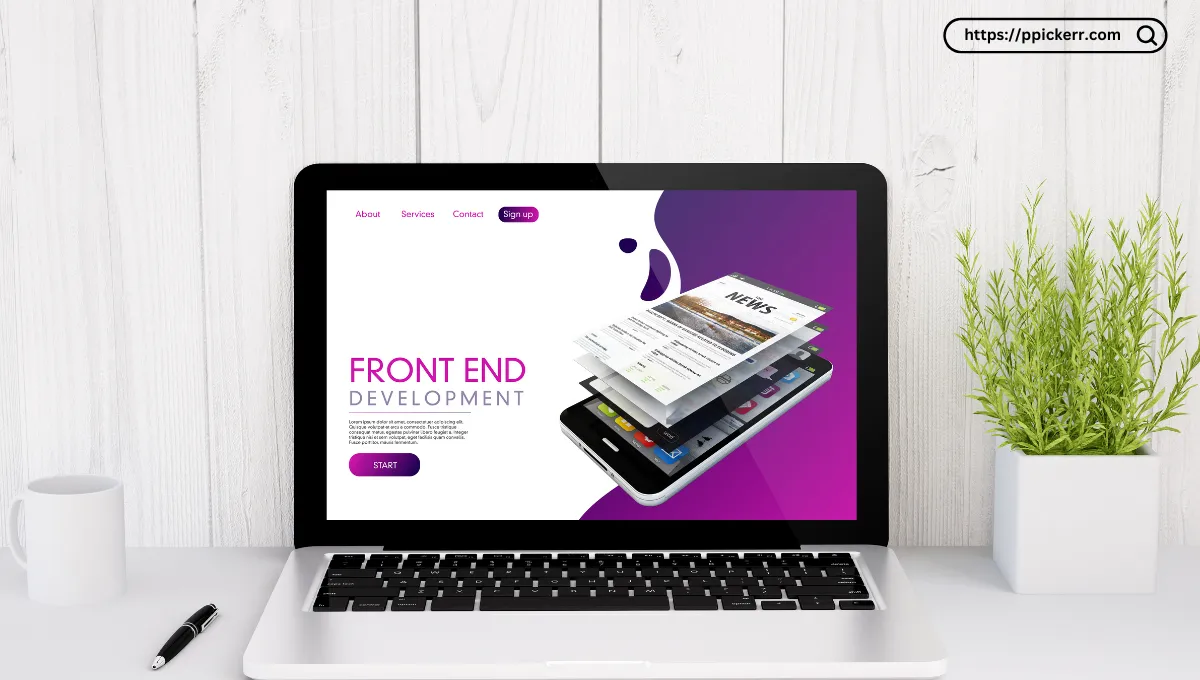
Color is one of the first things people notice when they open a website. It can help users understand hierarchy, recognize a brand, and distinguish buttons or important information. But color alone does not guarantee a particular emotion or conversion. Good web design combines color with context, contrast, typography and clear messaging.
What is color psychology in web design?
Color psychology is the study of how people may respond to colors and color combinations. In digital design, the practical goal is not to assume that every visitor will feel exactly the same way about a color. Instead, designers can use color intentionally to create visual hierarchy, reinforce brand identity and make interfaces easier to understand.
How common colors are often used
- Blue: frequently used by technology, finance and business brands because it can communicate reliability and clarity.
- Green: often associated with nature, growth and financial themes, although the meaning depends on context.
- Red: can create strong visual emphasis and is commonly used for alerts, warnings and calls to action.
- Yellow: can attract attention and create a bright, energetic visual tone, but needs careful contrast.
- Purple: is often used in creative, beauty and technology-oriented branding.
- Black and white: provide strong foundations for typography, contrast and minimalist interfaces.
Contrast matters more than color trends
A beautiful palette can still produce a poor interface if text is difficult to read. Check the contrast between text and its background, especially for buttons, navigation, form labels and important instructions. Do not rely on color alone to communicate an error or success state; combine color with text or an icon where appropriate.
A practical process for choosing a website palette
Start with the purpose of the website and the brand personality. Choose a primary color, then define a small supporting palette for backgrounds, text, borders and actions. Test the palette on real interface elements rather than judging it only from color swatches. You can use the USCart Color Picker to sample colors from an existing image or reference design.
Avoid using too many colors
Most interfaces are easier to understand when the palette has a clear hierarchy. A primary color can identify the brand, a secondary color can support visual sections, and neutral colors can handle most backgrounds and text. Reserve stronger accent colors for actions or information that genuinely needs attention.
Conclusion
Effective color use is less about following a fixed rule such as “blue always builds trust” and more about creating a consistent, readable and purposeful visual system. Consider audience, brand, context, contrast and accessibility together, then test the design with real users whenever possible.

Leave a Reply